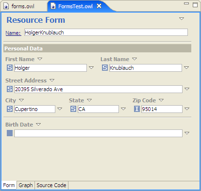
The Form Layout Panel in the Resource Editor is used to change the appearance and layout of the forms used in the Forms Panel. In a nutshell, this panel can be used to select which property widgets show up, how they are grouped together into sections, and how the whole page will be laid out. An example customized form is shown below. In contrast to the default forms, this form displays first name and last name side by side, groups together city, state and zip code, and furthermore contains separators and labels for display purposes.
Another example form is shown below. This uses one of the pre-defined standard layouts available in the Forms preferences (Window > Preferences... > TopBraid Composer > Forms). Instead of the default layout with three vertically arranged sections, this alternative setting uses a two-column layout with grayed labels. Furthermore, an input widget for rdfs:comment is always present, even if the selected resource does not have a value for it yet.
Form layouts are defined on a per-class basis. For example if you have a class Person you can change the layout associated with Person when Person is selected in your Resource Editor, and all instances of Person will use the new layout. Instances of subclasses of Person would "inherit" the layout from Person unless a more specific form layout has been defined. The layout of class and property forms can be changed as well, by means of editing the metaclasses rdf:Property and rdfs:Class (or their subclasses such as owl:Class), respectively. The Form Layout editor can be opened from the Form Layout tab at the bottom of the Resource Editor whenever a class is selected.
By default, the system will use standard form layout information. You can define custom layouts for each RDF file in your workspace, and the forms metadata will be stored in the .tbc configuration file. If an imported model also contains form customizations, then you can either reuse or override the imported forms. The forms metadata itself is based on an RDF Schema defined in a dedicated Forms ontology. This means that the form settings themselves are stored in RDF and can therefore (theoretically) be edited with any RDF compliant tool such TopBraid. More conveniently though, Composer provides a visual editor for forms, as shown in the next screenshot.
In order to use the form customization most effectively, a basic understanding of the forms ontology is helpful. The following image shows the class hierarchy of the system ontology used by TopBraid to represent forms.
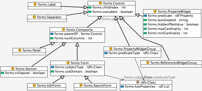
Each Control on a form represents a rectangular area on the screen. Static controls are Separators (horizontal lines) and Labels. Composites are controls that may contain child controls. Three types of composites are supported by Composer:
The editable areas on a form are represented by widgets. PropertyWidgets represent a editors for values of a given property. Widget groups are place holders for property widgets. For example, you can create a PropertyWidgetGroup for all properties that have the type owl:AnnotationProperty, without having to enumerate all possible annotation properties. The ReferencesWidgetGroup is a place holder for widgets for all incoming references.
The size and location of these controls on the screen are determined dynamically from their content and relation to each other. Any Composite (i.e. Form, Panel or Section) can be associated with layout information. In particular, you can specify whether the child controls of a composite shall be laid out in one column or multiple columns. With multiple columns, the available space on the form is evenly divided among the child controls. Within a column, all child controls are arranged from top to bottom in the order defined via their child indexes. This dynamic layout approach makes sure that widgets can grow dynamically if multiple values (or long values) are present.
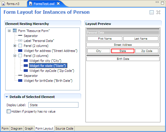
With a basic understanding of how the forms engine works, editing forms may be straight forward. On the Form Layout tab, the tree on the left shows the nesting of controls inside of their parent composites. Starting with the whole Form as the root, child controls are listed in their order of appearance. A preview of the resulting layout is shown in the right part of the page. In both areas, right-clicks on any element open a popup menu with actions to create child controls etc. The details of the selected control are shown in the lower left corner. The tree view provides full drag and drop support, allowing you to change the order and nesting of the available items. You can also drag and drop properties from other TopBraid views (e.g. from the Domain or Properties Views) to insert widgets for these properties.